By Michele DeFilippo (@1106Design)
 Wrapping a beautiful cover around a cheap or tacky book interior is a big mistake; a book is a total package. While potential readers might be intrigued enough by your cover to crack it open, they will be quick to reject a book that features poor typesetting or page design that lacks creativity, imagination, or worse – readability!
There are many elements involved in a successful interior design. Designers start by considering book size, binding, paper, page layout and typography, all of which work together to present your subject matter in an appropriate and attractive way. An experienced book designer then creates appealing pages that hold interest and convince the reader that your book is the one to buy. If the interior design of your book doesn’t surprise and delight you, don’t expect it to impress anyone else.
You may be tempted to do the page layout and typesetting yourself. Some authors will use word processing software, which does not have the settings necessary to achieve professional results. Alternatively they will spend hundreds of dollars buying professional design software (and hundreds of hours trying to learn to use these complex programs!). However, it’s a mistake to assume that no knowledge of typography or design is required to use the software effectively.
Only beginner self-publishers consider using a word processor for page layout. Established publishers wouldn’t think of producing the text in this manner. They know that experienced book designers bring real value to the table, offering creativity and aesthetic judgment that only comes with training and experience. Professional book designers adjust the text for better results, sometimes paragraph by paragraph, line by line, and even word by word. Why? Designers are trained to see the difference between “so-so” type and great type. As such, there are several dozen conventions to be followed in book design that may not be perceptible to the reader, but when followed, give your book a polished appearance. But it’s not only about knowing the rules; it’s knowing how and when to bend or break them on a case-by-case basis that makes the difference between an amateur layout and a professional one.
Still not convinced that it’s necessary to engage the services of a book designer? Look at the following “before” and “after” images of pages designed by the author and given a makeover by a book designer.
Before
(click each image for a larger version)
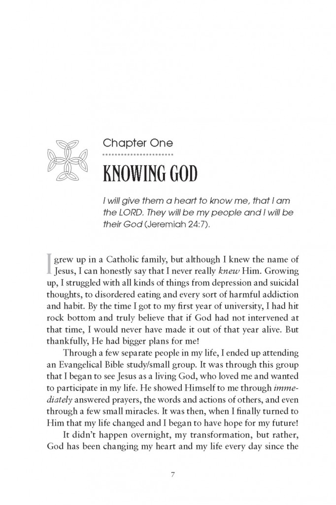
The chapter opener doesn’t look much different from any other page.
After
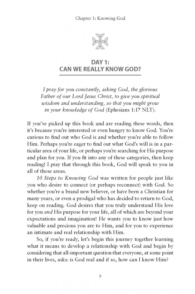
White space above and around the chapter number, title, quote, and icon make it clear that this is the start of a new chapter.
Before
The section opener looks more important than the chapter opener! A reader could be forgiven for getting confused.
After
The white space and the icon make it clear that this is the start of a new section but not a new chapter. (The page header has been redacted.)
Before
This title page, designed by the author using InDesign, is proof that software is just a tool and that experience and training are equally important.
After
Note the new book title and subtitle. Imagery from the front cover really makes the title page pop.
Before
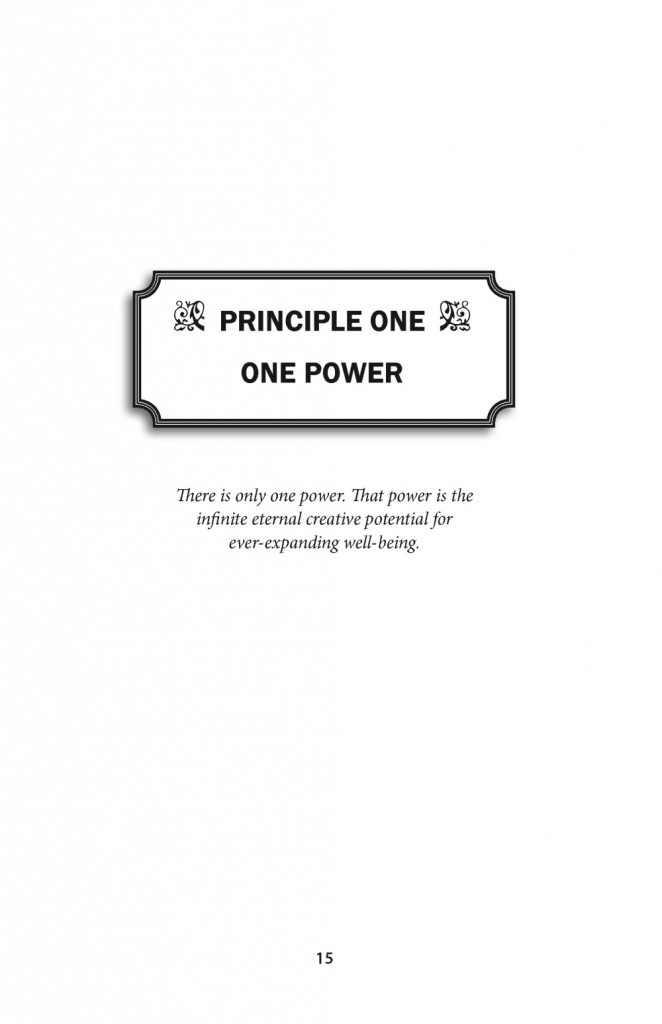
The shapes and icons lack imagination and polish. The chapter title, constrained in the box, contradicts the promise below of “ever-expanding well-being.”
After
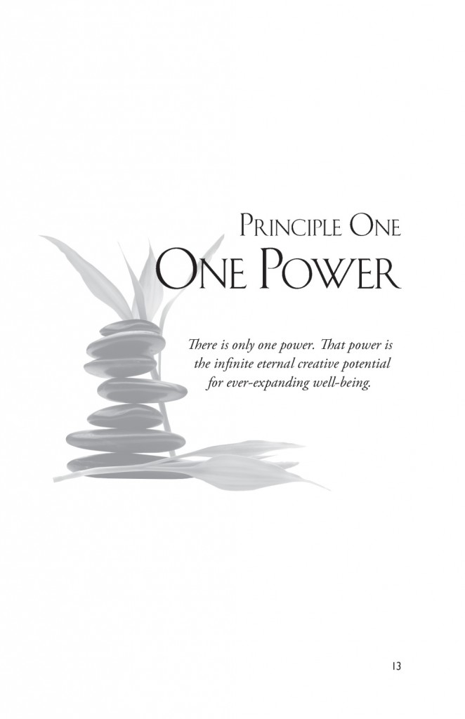
The imagery, chapter title overlap, and properly-used white space invite the reader into the new chapter.
You can find more interior samples at http://1106design.com/samples/interior-samples/.
About the Author
 Michele DeFilippo is the owner of 1106 Design, a Phoenix-based company that works with authors, publishers, business pros, coaches, consultants, speakers—anyone who wants a beautiful book, meticulously prepared to industry standards.
For further information, visit http://www.1106design.com.
Copyright: aspect3d / 123RF Stock Photo




Michele Defilippo says
Thanks for sharing my post, Nina. I’ll be happy to answer your readers’ questions. I invite anyone who is interested to download our complimentary 88-page PDF, “Publish Like the Pros: A Brief Guide to Quality Self-Publishing and an Insider’s Look at a Misunderstood Industry” at http://1106Design.com/resources/
Nina Amir says
Thanks so much, Michele! It’s a great post, and I look forward to publishing more of your great advice.
Chris O'Byrne says
Beautiful work, Michelle!
Jennifer Wenzel says
Gorgeous examples of interior book design! I’ll be tweeting this out right away.